Most people are used to seeing financial statements as long tables full of numbers. They’re written in columns, top to bottom, and not made for people to easily understand. They were built to follow rules—not to help someone see what’s going on.
FS T-Graph changes that.
It takes the same financial data and shows it in a clear, organized way. You don’t have to guess what the numbers mean, because you can now see how everything connects—side by side, piece by piece.
It’s financial thinking made simple. And finally, visual
🔷 What Is FS T-Graph?
FS T-Graph is a new way to show financial statements using tiles/blocks instead of tables.
It takes common reports like the Balance Sheet and Income Statement and turns them into easy-to-read layouts made of stacked tiles. Each tiles stands for an account, sized to match its value, and placed in a clear spot on the screen.
It’s based on the “T-account” format that many students learn in school, but made easier to see and understand.
Everything is placed in a way that helps people see how the parts connect and balance.
🧩 What’s a Tiled Graph?
Tiled Graph is the heart of FS T-Graph.
It’s the visual engine where:
- Each tile = an account or category
- Height = proportional value
- Label = value and vertical analysis percentage
- Stacking = structural hierarchy
- Left vs. Right = duality of cause and effect
Tiled Graphs aren’t just “chartified” statements. They are intelligent reconstructions of the financial report—showing structure, balance, and movement at a glance.
We use them to build:
- The Balance View
- The Income View
- The Cash Flow View
- Future account-level drilldowns (e.g., how receivables move)
It helps people understand. It shows how things work. It clears up the confusion.
🔥 What Problem Are We Solving?
Today’s financial statements are:
- Difficult for non-accountants to interpret
- Visually disconnected from the business story they represent
- Slow to communicate risk, proportion, and flow
Traditional reports demand translation. Tiled Graphs eliminate that barrier.
They make it obvious when:
- One cost dominates the Income View
- Assets are disproportionately funded by debt
- Profitability shrinks even when revenue grows
💡 Why Visual FS Matters Now
Because everyone is visual now.
From dashboards to infographics to social content, visual information is everywhere—except financial statements.
By building FS T-Graph as a tile-based canvas, we’re saying:
- People deserve to understand their numbers
- Students deserve tools that teach logic, not just rules
- Decision-makers deserve clarity without decoding
We’re not replacing accounting—we’re revealing it.
👥 Who Is This For?
- Business Owners who want fast insight without needing to “read” a report
- Students who learn best by seeing structure
- Educators who want to visually explain flows
- Financial Designers looking for next-gen reporting layers
- Analysts who crave comparative views that make deviations obvious
🧱 The Five Views of FS T-Graph
- Balance View
The visual core. A dual-stack layout where Assets rise on the left and Liabilities + Equity on the right. Every tile is sized by value and color-coded by category. It captures financial position in a single glance, with an optional T-Spine marking vertical scale and reference anchors. - Income View
Designed like a visual funnel: Revenue inflows stack on the left, Expense outflows on the right. Net Income becomes a bridging tile—showing whether the business kept more than it spent. Labels integrate vertical analysis automatically. A kinetic portrait of performance. - Cash Flow View (under development)
A timeline-inspired layout dividing cash movements into Operating, Investing, and Financing flows. Each stack shows cash in vs. cash out per section, visualizing how liquidity is generated and used. Ideal for understanding runway, burn rate, and cash structure. - Account-Level View
The micro lens. A single T-Graph tile becomes its own system. For example: - Accounts Receivable: Opening + Credit Sales Inflows vs. Collections + Write-Offs
- Inventory: Purchases vs. Cost of Goods Sold
This view reveals the movement inside each account—like zooming into a financial bloodstream. - Ratio View (analytical overlay)
Visual callouts for key financial ratios—Current Ratio, Debt-to-Equity, Return on Assets—mapped to the Balance and Income Views. Instead of being presented in a table, ratios are drawn from the proportions of the stacks themselves, making them intuitive and visual.
🔮The Vision: Where we’re going with FS T-Graph
We’re not just redesigning how financial statements look. We’re rebuilding how they’re understood, used, and shared. This journey isn’t one product—it’s a progression of tools, ideas, and systems that all speak the same visual language: the Tiled Graph.
1. 📘 The Book: Spreading the Framework
We begin by launching a comprehensive eBook that documents:
- The logic and anatomy of FS T-Graph
- Step-by-step guides to the five core views (Balance, Income, Cash Flow, Account-Level, Ratio)
- How to build them manually or via automation in Excel
- Practical use cases for students, SMEs, and analysts
- Visual storytelling principles for accounting education
This becomes the foundational reference. A manifesto meets manual—a movement in print.
2. 🌐 The Online App: Visual FS for Everyone
Next, we bring FS T-Graph to life as a cloud-based platform where users can:
- Upload or connect their trial balance
- Select a view (Balance, Income, Cash, etc.)
- Customize tiles, labels, and layout preferences
- Export visual FS as reports, slides, or shareable links
- See real-time tiled reconstructions of their statements
No coding. No formulas. Just click, tile, and understand.
Think: Canva for financial statements.
3. 🔌 The Plugin: Extending Into Existing Tools
To meet users where they already work, we’ll build T-Graph plugins for:
- Excel and Google Sheets (with VBA/GAS-powered tile renderers)
- Popular accounting platforms like QuickBooks, Xero, Zoho
- BI tools like Power BI or Tableau (as a visual FS pack)
This integrates T-Graph logic into the existing accounting ecosystem—making it frictionless to adopt.
4. 🔁 The API: Converting Dashboards into Tiled Graphs
For developers and software vendors, we offer a Visual FS API:
- Input: Raw account data, trial balance, or standard FS report
- Output: Tiled Graph JSON, SVG diagrams, or embeddable visuals
- Optional: Comparative views, animations, and ratio overlays
This enables any platform—ERP, BI tool, SaaS—to transform their FS output into intuitive tile-based visuals with zero reinvention.
5. 🎓 The Future: A Visual Standard for Accounting
Beyond tools, FS T-Graph becomes a visual language standard taught in:
- Business schools and accounting classrooms
- Financial literacy seminars
- SME onboarding programs and digital finance platforms
It’s a format people recognize, expect, and even prefer.
Eventually, we see:
- Tiled Graph FS reports published alongside traditional FS
- Visual summaries embedded into tax filings or audit reports
- A world where accounting is not just correct—but clear
⚡ Why This Blog Exists
This is my first revelation in an open journal. It’s how I’m sharing my design decisions, frustrations, and breakthroughs in building the future of visual finance.
I’m not launching a finished product—I’m inviting you into the conversation as I build it in public.
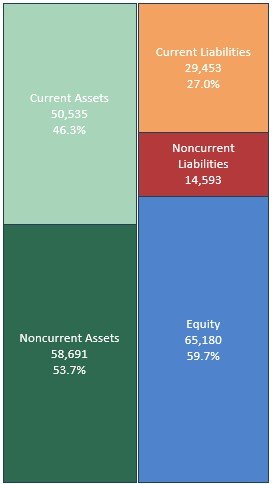
Next, we explain more about FS T-Graph. Today, we leave you with the high-level Balance View—the first glimpse of what it means to see finance with fresh eyes.
👀 Teaser: The FS T-Graph Balance View

This is FS T-Graph.
This is Tiled Graph logic.
This is how financial statements begin to speak.
Stay tuned. 🙂
About the Author
Greg V. Aquino, CPA is an accounting professional from the Philippines with a background in public practice and a practical approach to financial problem-solving. A graduate of Saint Louis University, he developed his expertise through years of working with client data and Excel-based analytics.
FS T-Graph wasn’t part of the plan—it emerged unexpectedly, from a growing realization that financial statements could be seen differently. Greg followed that instinct, collaborating with AI to shape a visual framework that helps make financial structure easier to understand. Today, he serves as the founder of FS T-Graph, a project built on clarity, curiosity, and the belief that sometimes, new perspectives come when you least expect them.
Declaration of Origin
FS T-Graph is an original visual framework for financial statements developed by Greg V. Aquino, CPA, beginning in June 2025. Built from first principles and shaped by years of field experience, its logic, structure, and visual grammar were independently conceived and published to support financial clarity, education, and innovation.


